This case study is protected
Enter the password to view this work.
Incorrect password. Try again.
Don't have the password? Request access
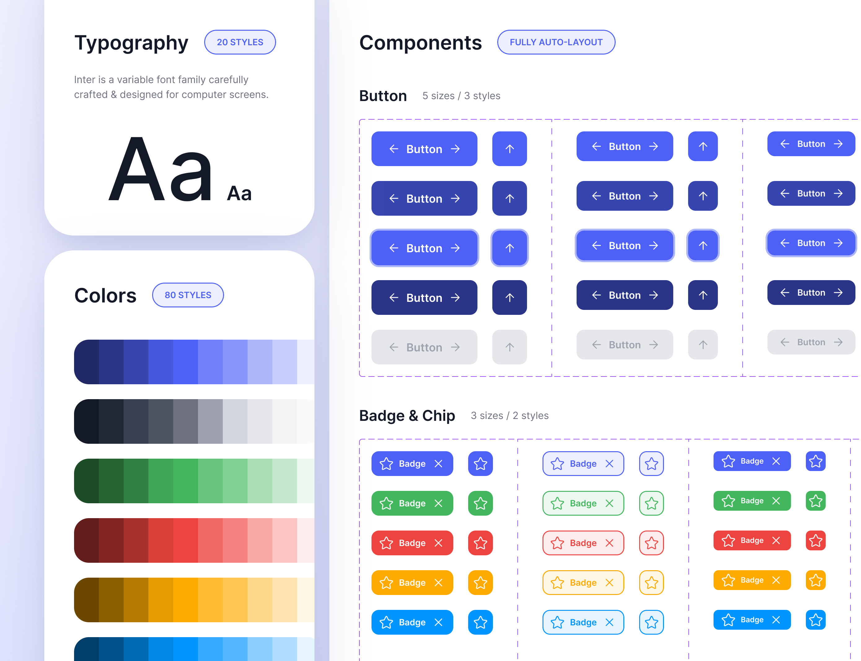
Design systems
Scaling design through systems, documentation, and inclusive foundations
I contributed to Booking.com's Design System through component design, research-driven tooling, documentation improvements, and accessibility work. My focus was on strengthening foundations, reducing ambiguity, and enabling teams to design and build with clarity, consistency, and care.
Component patterns: sort & filter indicators
Complex components involving interaction logic like sorting and filtering were frequently reinvented across teams, creating inconsistent behaviours and unclear user feedback.
Solution: Defined clear behavioural rules (single vs. multi-select), updated label and indicator patterns, explored placement options, and documented precise guidance to reduce ambiguity. Partnered with engineering to spec logic and edge cases.
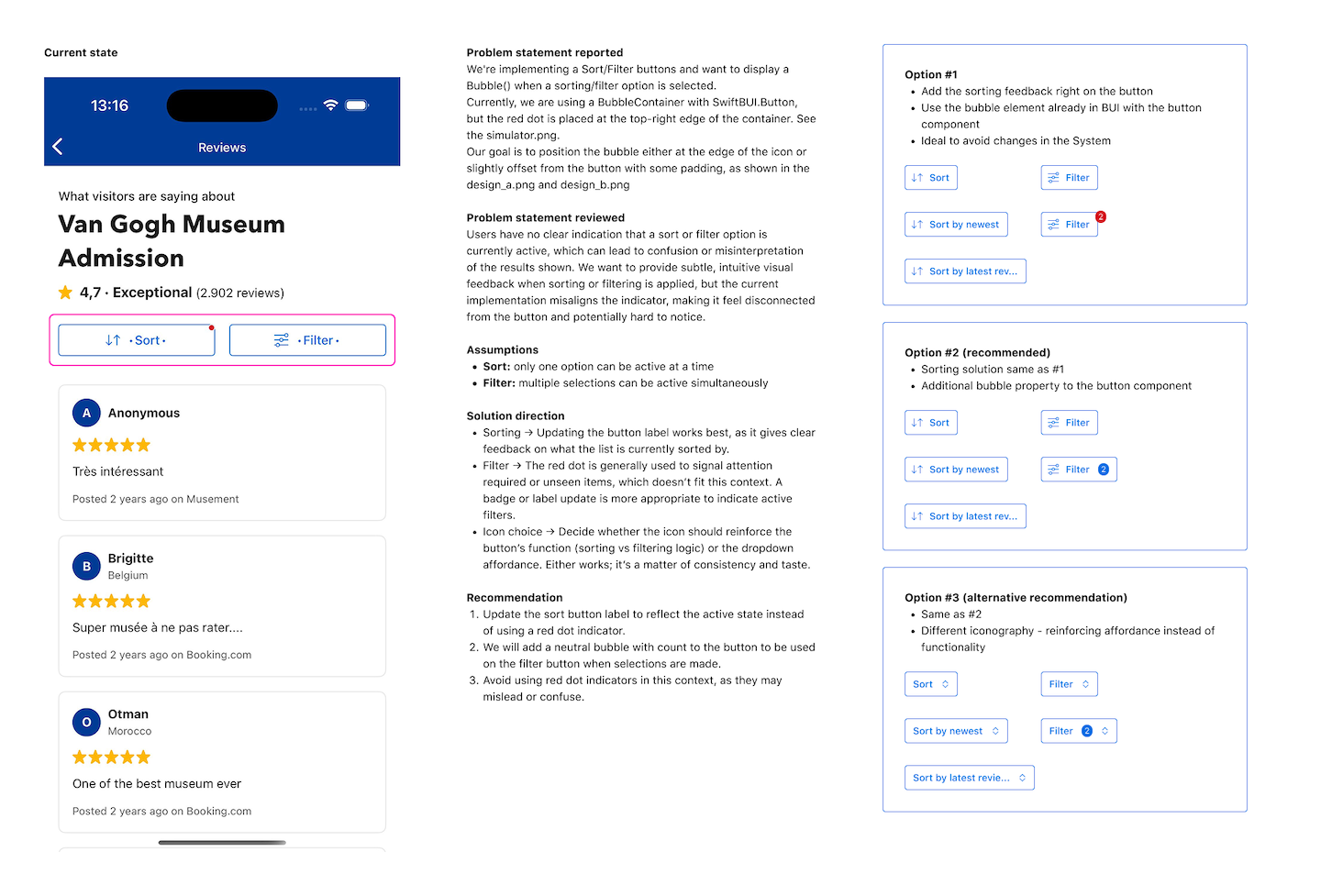
Sort and filter indicator exploration: problem framing, assumptions, recommended behaviour, and design options aligned with system patterns.
Research: Verify Design plugin
We developed an internal Figma plugin to validate spacing, colour, typography, and component usage. Before recommending broad adoption, we needed to assess its impact on workflows.
Approach: Designed and led a controlled time & motion study comparing plugin vs. no-plugin workflows, measuring time-to-complete, error count, and correction confidence. Analysed behaviours to improve plugin logic and presented findings to leadership for next iterations.
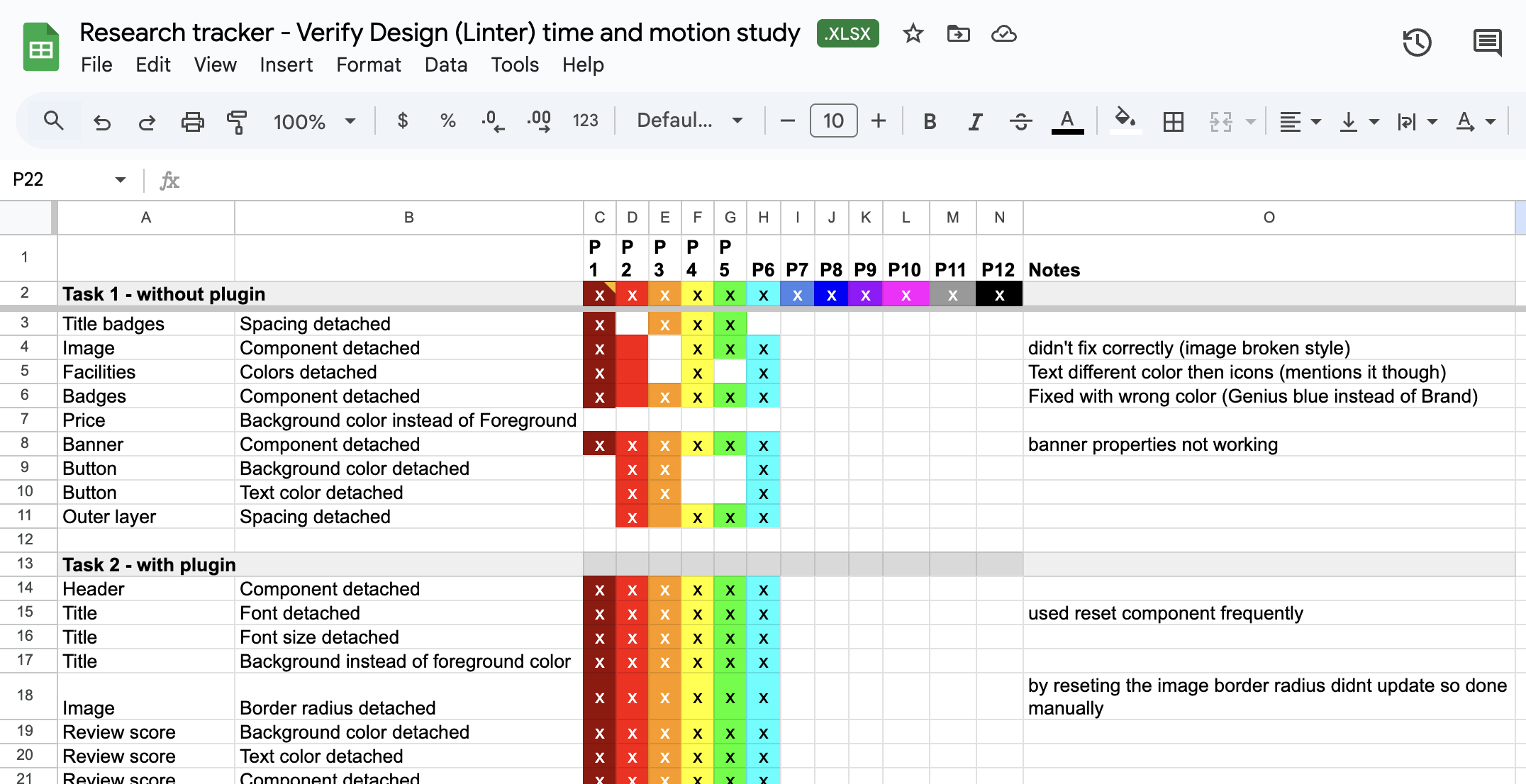
Research tracker used during the time & motion study, capturing component deviations observed across participants.
Documentation & storytelling
Documentation lived across different repositories with varying standards and inconsistent levels of detail. Design Systems can also feel abstract without real-world context.
What we did:
- Audited all existing documentation across platforms
- Designed a unified structure for interaction, visual, and content guidelines
- Created reusable documentation templates for cross-team adoption
- Developed a storytelling format highlighting real product cases, shared through demos, newsletters, and presentations to reveal challenges, teach usage, and celebrate alignment
Accessibility and inclusive design
A scalable system must support a wide range of user needs beyond basic accessibility compliance.
What we did: Audited core components with accessibility and DEI partners, strengthened defaults for colour, language, and focus behaviour, improved guidance around inclusive usage, and facilitated discussions about responsible design practices across teams.
Impact
- Improved clarity and reusability of complex UI components
- Reduced design-QA friction through research-validated plugin tooling
- Faster onboarding through unified documentation and structured guidance
- Stronger shared understanding across teams through stories and research artefacts
- More inclusive and accessible foundations across system components